Part I: Python Fundamentals
Chapter 5
Data Visualization for Petroleum Engineers
Get the TL;DR and the key concepts before you dive in — or as a quick review after.
Every major decision in petroleum engineering starts with a picture.
A production decline plot determines whether a field gets $200 million in new investment or gets scheduled for abandonment. A well log display tells a completion engineer exactly where to perforate. Get it wrong, and you produce water instead of oil. A pressure map tells a reservoir engineer where to inject water to sweep remaining oil. A bubble map shows a field manager where production is coming from and where it is dying.
Tables of numbers do not drive these decisions. Charts do. The reason is simple: a chart turns the data into shape, slope, and outlier (things the eye reads in a glance) while the same information in rows and columns has to be read one number at a time. A table of 25 wells over 36 months is 900 numbers; a single decline-curve overlay, color-coded by region, says the same thing in seconds.
This chapter builds every visualization type that petroleum engineers use in practice. Each one exists because it answers a specific engineering question. Understanding why each chart type exists, what question it answers, what pattern it reveals, what decision it supports, matters more than memorizing the Matplotlib syntax that draws it.
infoWhat You Will Learn
- Build publication-quality plots with Matplotlib using the
fig, axpattern - Create the standard petroleum chart types: production time series, decline curves, crossplots, bar charts, bubble maps, and cumulative production plots
- Construct multi-panel production surveillance displays with shared time axes
- Build a well log "triple combo" display and interpret what it reveals
- Use Seaborn for statistical exploration of well and reservoir properties
- Assemble a multi-panel field report suitable for a management committee presentation
lightbulbDatasets Used in This Chapter
All data is generated in-code using NumPy and Pandas. No external files are required. The synthetic data simulates realistic production histories, well coordinates, reservoir pressures, water cuts, and well log responses so every example runs on any machine.
Why Each Chart Type Exists
The petroleum industry standardized around a handful of chart types because each answers a question other formats answer poorly:
- Decline curve (rate vs. time on a log axis): how long will this well produce, and how much is left?
- Crossplot (one property against another, often log-scaled): are two rock properties related, and how strongly?
- Production surveillance (rate, water cut, and GOR stacked over time): what is changing downhole, and is an intervention due?
- Correlation heatmap and pair plot: across many wells, which properties move together?
Each of these exists because an engineer needed to make a better decision. That is the standard every visualization in this chapter meets.
Matplotlib Fundamentals
Matplotlib is the foundational plotting library in Python. Nearly every other visualization tool in the scientific Python ecosystem, including Seaborn, Pandas plotting, and parts of scikit-learn, is built on top of it.
The core concept is the Figure and Axes model. A Figure is the entire canvas. An Axes is a single plot within that canvas. One figure can hold one axes or many. This separation is what lets you control each element independently.
Every Matplotlib plot follows this skeleton:
fig, ax = plt.subplots()creates one figure and one axes.figsize=(9, 5)sets the canvas dimensions in inches.ax.plot()draws data. First argument is x-values, second is y-values. Everything after is styling.ax.set_xlabel(),ax.set_ylabel(),ax.set_title()set labels. An unlabeled plot is useless in engineering: nobody should have to guess what the axes represent.ax.legend()displays the legend using thelabelset inax.plot().ax.grid(True, alpha=0.3)adds a subtle grid. Thealphacontrols transparency.plt.tight_layout()adjusts spacing to prevent clipping.
lightbulbAlways Use `fig, ax = plt.subplots()`
Code examples online often use plt.plot() directly without creating fig and ax. That shortcut works for throwaway plots but breaks the moment you need subplots, shared axes, or precise control. Always use fig, ax = plt.subplots(). One extra line saves hours of debugging.
Production Time Series: Multi-Well Overlay
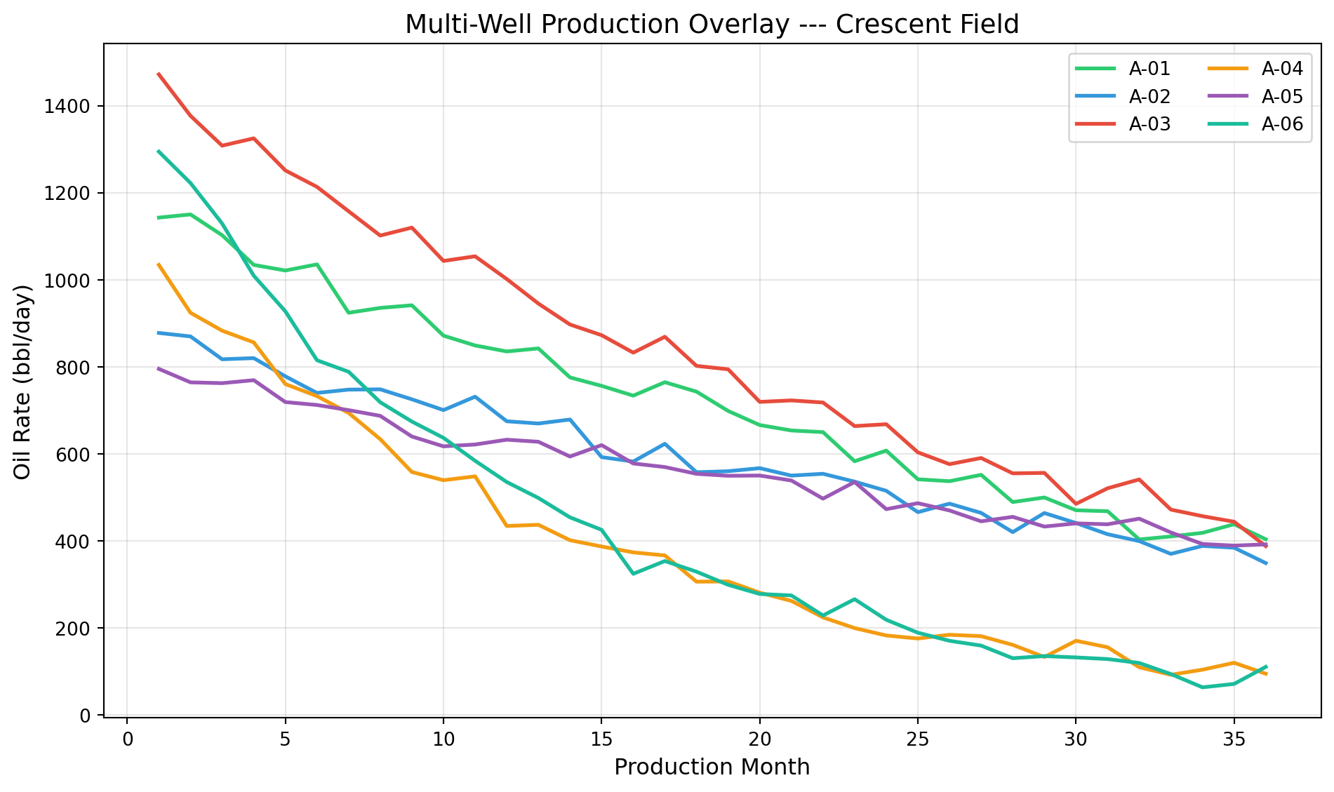
One well is informative. Twenty-five wells on the same plot reveal which wells are carrying the field and which are dragging it down. When the question is "which wells are declining fastest?", the answer is a multi-well overlay where the eye immediately separates strong performers from weak ones.
Wells OD-007 and OD-011 separate visually from the pack. The steep decline could indicate several things: higher drawdown, a smaller drainage area, less reservoir support, or water coning. The plot does not diagnose the cause (that requires further analysis, in Chapters 9 and 11) but it immediately tells you where to focus your attention.
Cumulative Production: Smoothing the Noise
Monthly production rates are noisy. Wells shut in for workovers, facilities hit capacity constraints, allocation methods introduce errors. This matters for reserves estimation: when rate data is too noisy to fit a reliable decline curve, cumulative production often reveals the underlying trend more clearly.
This plot reveals something that a rate-vs-time plot obscures: Well OD-005, despite starting at a lower rate than OD-011, ends up producing more total oil because its decline is gentler. In petroleum economics, cumulative production is what generates revenue. A well that starts high but crashes quickly can be less valuable than one that starts moderate but sustains.
Crossplots: Porosity vs. Permeability
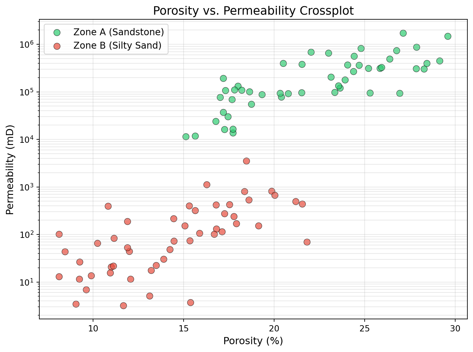
A crossplot places one rock property on the x-axis and another on the y-axis. The porosity-versus-permeability crossplot is one a reservoir engineer reaches for constantly.
The relationship between porosity and permeability is roughly log-linear: permeability climbs exponentially as porosity rises, so on a log axis it falls on a near-straight line. This is not arbitrary; it follows from the rock. Porosity measures how much void space exists in the rock. Permeability measures how easily fluid flows through that void space. Flow depends not just on how much pore space exists but on how the pores are connected, specifically, on the size of the pore throats. Pore throat distributions in natural rocks tend to follow log-normal distributions, which is why permeability spans orders of magnitude (from 0.01 millidarcies in tight rock to 10,000 millidarcies in high-quality sand) while porosity varies within a much narrower band (5% to 35%).
This is why petroleum engineers always plot permeability on a logarithmic y-axis. On a linear scale, any data point below 100 mD would be invisible. On a log scale, the full range is visible and the trend that connects porosity to permeability becomes clear.
At the same porosity, Zone A has roughly ten times the permeability of Zone B. This tells the reservoir engineer that Zone A is the primary flow unit. It is where fluid moves, where production comes from, and where perforations should be placed. Zone B stores hydrocarbons but delivers them slowly. This distinction, between storage capacity (porosity) and deliverability (permeability), is fundamental to reservoir characterization, and the crossplot makes it immediately visible.
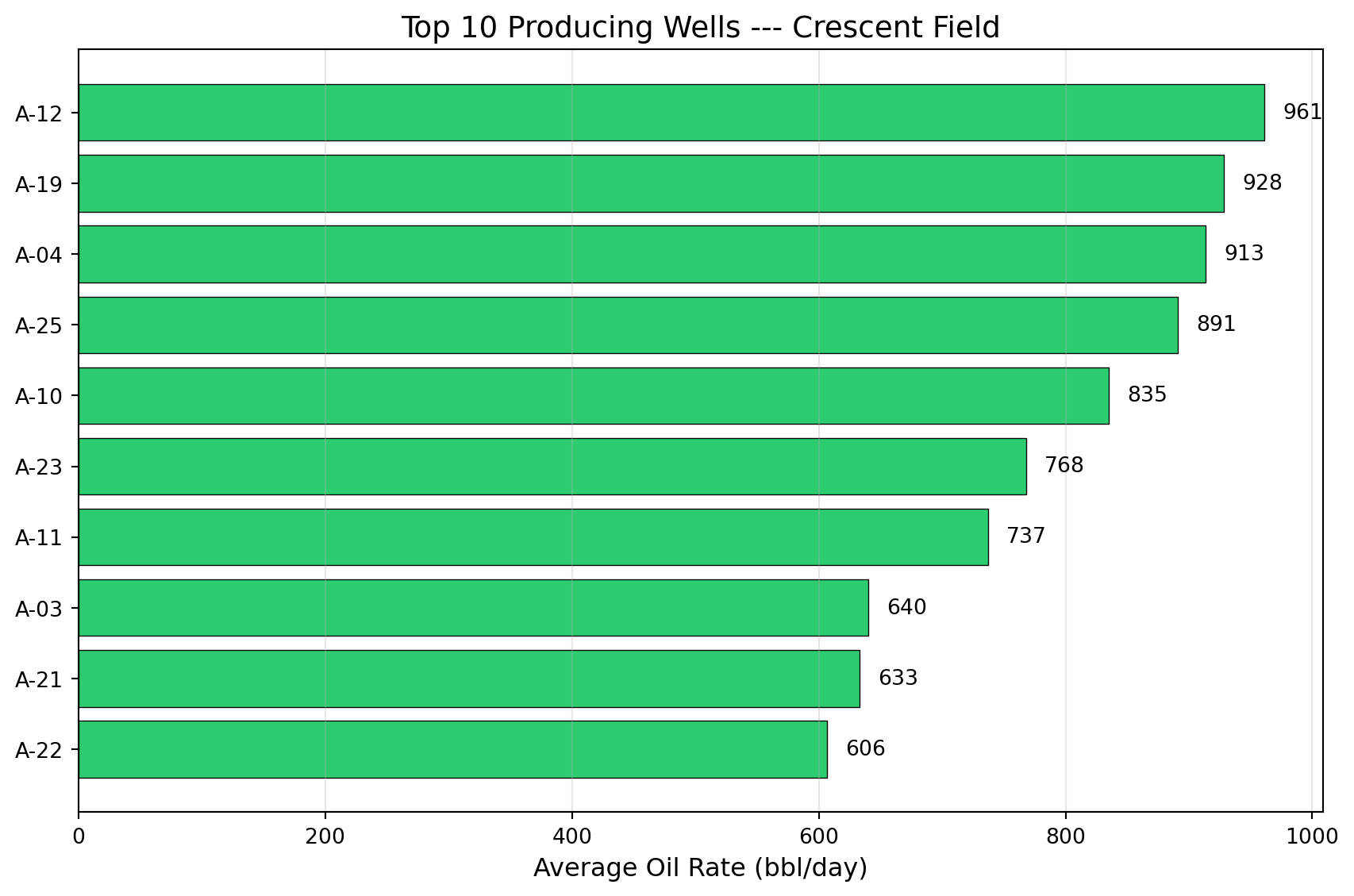
Bar Charts: Ranking and Comparing
Bar charts are the simplest and most direct way to compare wells, fields, or operators. When someone asks "which wells produce the most?" or "how does this field compare to the offset?", the answer is a bar chart.

infoHorizontal vs. Vertical Bars
Use horizontal bars (barh) when comparing named items: well IDs, field names, operators. Names read left-to-right naturally. Use vertical bars (bar) when the x-axis is numeric or time-based. This is a small choice that makes a large readability difference.
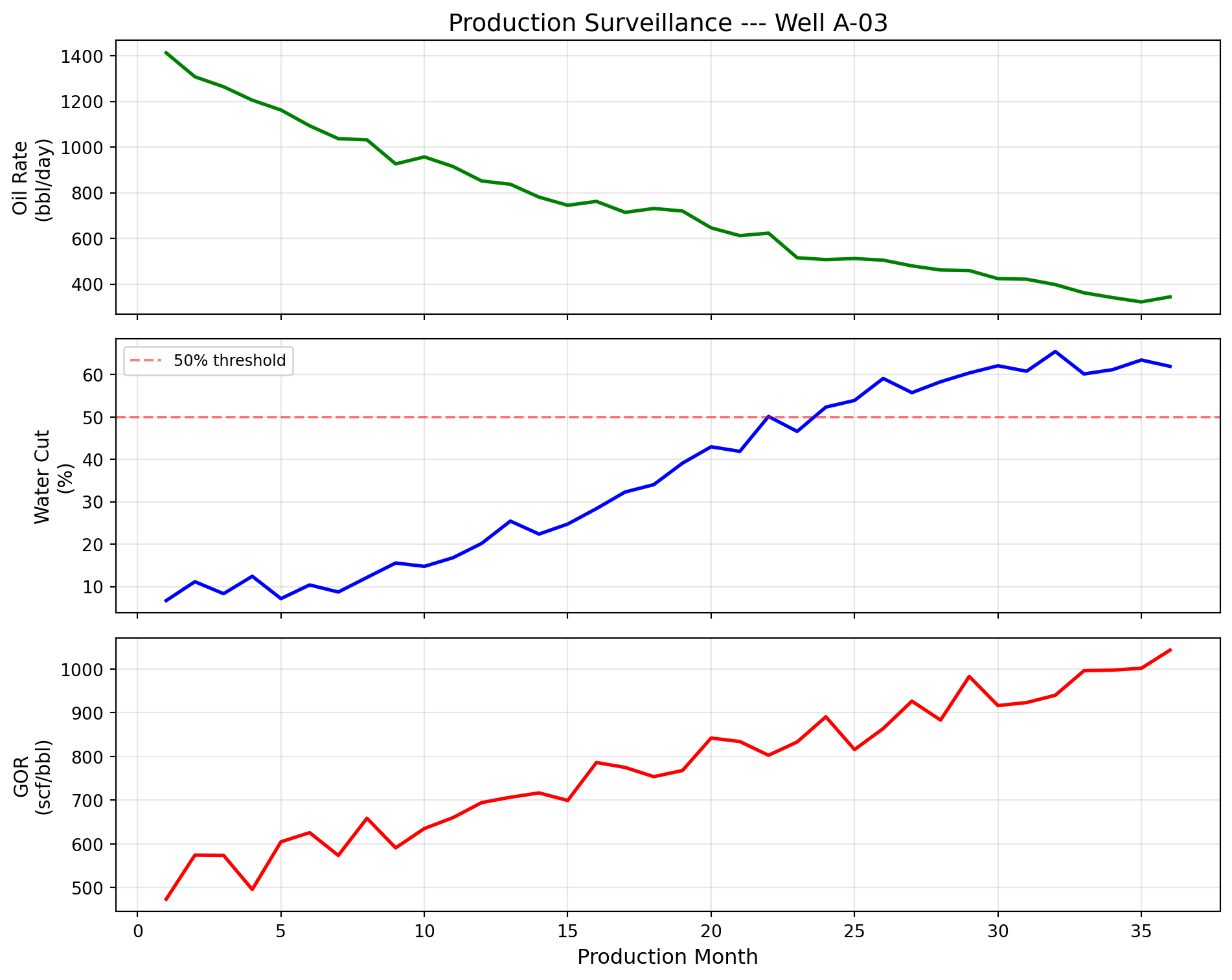
Multi-Panel Subplots: Production Surveillance
In production surveillance, engineers do not examine oil rate in isolation. They look at oil rate, water cut, and gas-oil ratio together, stacked vertically with a shared time axis. The reason is physics: these three measurements are linked by reservoir behavior.
If oil rate drops while water cut rises, water is displacing oil. That is either a waterflood response (intentional and good) or water coning (unintentional and problematic). If GOR spikes, gas is breaking through; reservoir pressure may have dropped below the bubble point, liberating dissolved gas.
The multi-panel display with sharex=True locks all panels to the same time axis. When you point at a feature in the oil rate panel, your eye drops naturally to the same month in the water cut and GOR panels. The correlation (or lack of it) between panels is the diagnostic information.
This three-panel layout is so common that many operating companies have standardized templates for it. Some companies add a fourth panel for reservoir pressure or a fifth for injection rates in waterflooded fields. The design principle remains the same: stack related measurements vertically with a shared time axis so that correlations across measurements are immediately visible.
Well Log Display: The Triple Combo
The well log display stacks three measurement tracks (gamma ray, resistivity, and density-neutron porosity) against depth, with depth increasing downward. This format evolved because it directly represents the physical reality: you are looking at a vertical cross-section of the earth, layer by layer.
Each track measures a different physical property of the rock:
- Gamma Ray (GR) measures natural radioactivity. Shales are radioactive because they contain potassium, uranium, and thorium in their clay minerals. Clean sands and carbonates have low radioactivity. The GR log therefore distinguishes between reservoir rock (sand, low GR) and non-reservoir rock (shale, high GR). A cutoff, typically around 60 API units, separates the two.
- Resistivity measures how well the rock conducts electricity. Water conducts electricity readily (low resistivity). Oil and gas do not (high resistivity). A sand zone with high resistivity therefore contains hydrocarbons. The magnitude of the resistivity increase, compared to a known water-bearing zone, is used in Archie's equation (Chapter 7) to calculate water saturation.
- Density-Neutron porosity uses two independent measurements of porosity. When they agree (overlay), the pore space contains water. When the density porosity reads higher than neutron porosity (a "crossover"), the pore space contains light hydrocarbons (gas or light oil): their low hydrogen content pulls the neutron porosity down while their low density pushes the density porosity up.
Together, these three tracks answer the critical question: Is there a producible hydrocarbon zone, and where exactly is it?
Reading this log from left to right: The GR track identifies two sand intervals (yellow shading where GR drops below 60 API). The resistivity track shows that the deeper sand (7,200–7,350 ft) has a dramatic resistivity spike; that is the hydrocarbon signature. The shallower sand (7,080–7,150 ft) has moderate resistivity, indicating water-bearing sand. The density-neutron overlay confirms: in the deeper sand, density porosity rises above neutron porosity (crossover), confirming light hydrocarbons in the pore space. The shallower sand shows no crossover: water.
The interpretation: perforate from 7,200 to 7,350 ft. That is the pay zone. Skip the shallower sand; it will produce water.
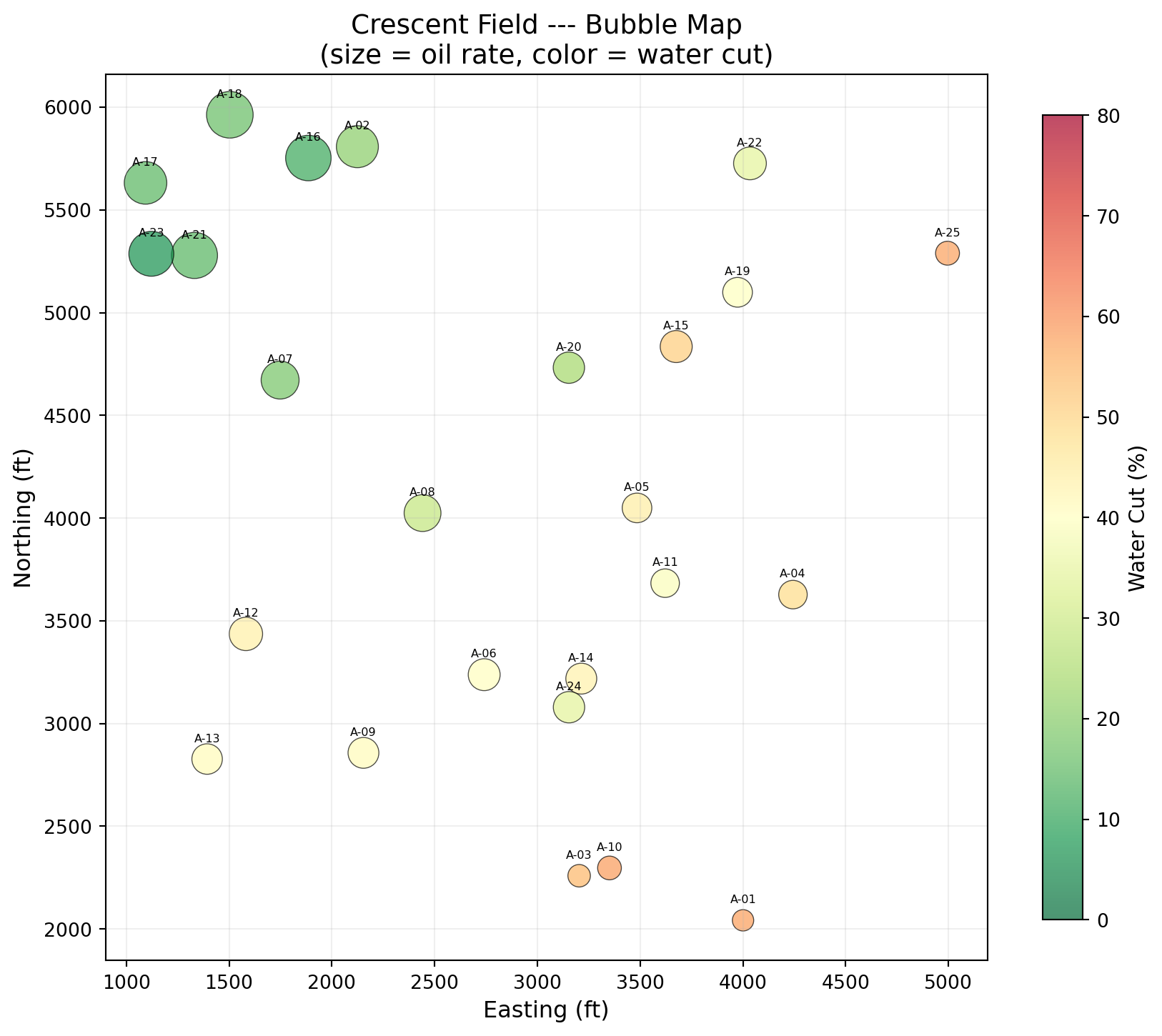
Bubble Maps: Spatial Production Display
A bubble map places wells at their geographic coordinates and sizes each marker by a production metric. It answers the question every field manager asks: "Where is the production coming from?"
The reason this matters is geology. Petroleum reservoirs are not uniform. Structural position (how high on the anticline), stratigraphic variation (sand thickness, quality), and proximity to faults all affect individual well performance. A bubble map overlays production data on space, making geological patterns visible without requiring a geological model.

Three dimensions of information in one figure: location (position), production rate (circle size), and water cut (color). The northwest cluster has large green circles (high production, low water cut). The southeast wells have small red circles (low production, high water cut). This pattern suggests water encroachment from the southeast and a structural high or better reservoir quality in the northwest.
That spatial insight guides where to drill the next well.
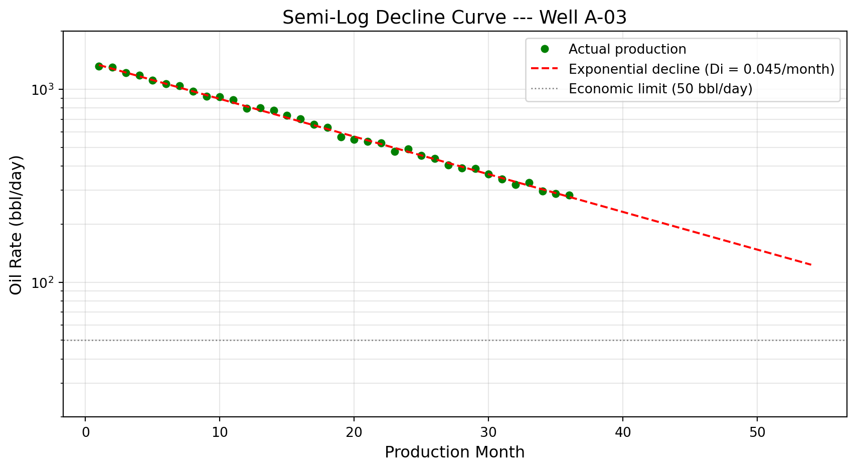
Decline Curves on a Semi-Log Scale
Decline curve analysis is covered thoroughly in Chapter 9. The visual format is introduced here because it is so fundamental to how the industry thinks about well performance and reserves.
When production rate is plotted on a logarithmic y-axis against time, an exponential decline becomes a straight line, and a straight line is easy to extrapolate. You extend it forward until it hits an economic limit (the minimum rate at which the well covers its operating costs). Where it crosses that limit is the well's remaining economic life. The area under the curve is the remaining reserves.
Seaborn: Statistical Visualization for Reservoir Data
Before building a formal analysis, you need to see the shape of the data: which wells are typical, which properties move together, where the outliers are. Seaborn answers these exploratory questions in one or two lines, where Matplotlib would take ten. Matplotlib gives total control; Seaborn gives speed. Built on top of Matplotlib, Seaborn specializes in visualizing distributions, relationships, and categories.
Distribution of Initial Production Rates
Initial production (IP) rate distributions are important because they characterize what a "typical" well in the field looks like.
The right-skewed distribution is extremely common in oil and gas. Most wells are moderate producers, a few are excellent, and a handful are marginal. This asymmetry is why the industry uses percentile statistics (P10, P50, P90) rather than averages: the average is pulled upward by a few prolific wells and does not represent the "typical" well.
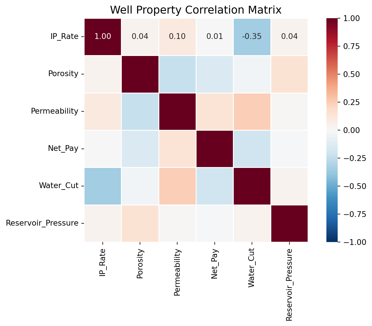
Correlation Heatmaps
When you have multiple well properties, a correlation heatmap reveals which properties move together. A strong positive correlation between two properties may indicate a physical relationship worth investigating. A surprising absence of correlation may challenge assumptions.

A correlation of +1 means two properties move in lockstep; -1 means they move in opposite directions; 0 means no linear relationship. In this data, expect porosity and permeability to be positively correlated (more pore space generally means better connectivity). Any strong unexpected correlation, or the absence of an expected one, is worth investigating further.
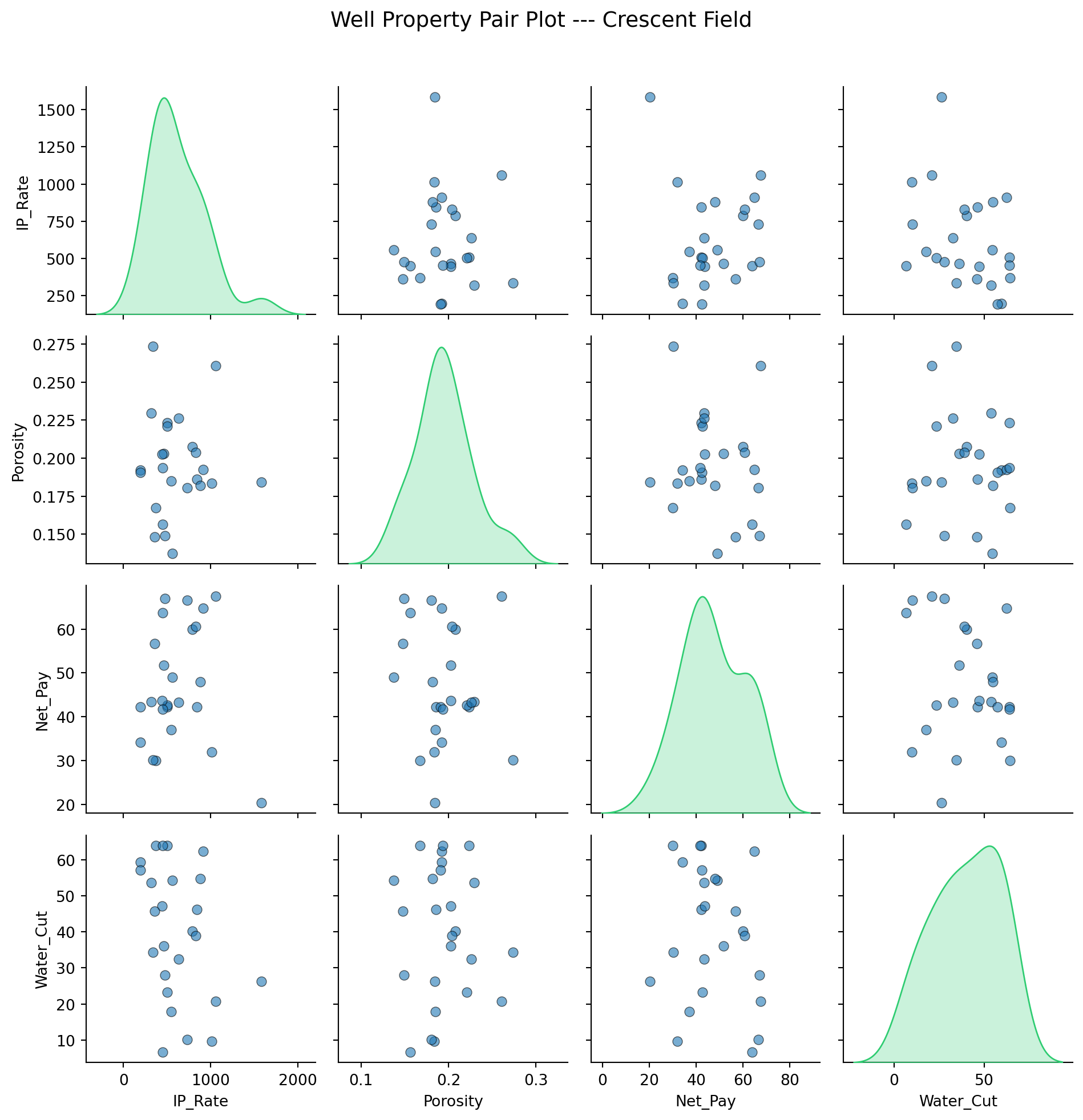
Pair Plots: All Relationships at Once
When you want to see the actual scatter of every property pair, not just the correlation coefficient, Seaborn's pair plot creates a grid of scatter plots with distributions along the diagonal.

Pair plots are the first tool to reach for when exploring a new dataset. They reveal outliers, clusters, and non-linear relationships that summary statistics miss.
Bringing It Together: The Field Report
Everything in this chapter converges into a single deliverable: a multi-panel field summary that communicates the state of a field to a management audience. Four panels (production trend, water cut trend, well ranking, and spatial map) in one figure.
Four panels. The top-left shows the production decline that triggered the meeting. The top-right shows water cut rising across the field, which explains part of the decline. The bottom-left ranks current well performance so management knows where to focus. The bottom-right shows the spatial distribution, revealing that the best-performing wells cluster in the northwest.
If data updates next month, you re-run the script. The entire report regenerates in seconds.
lightbulbSaving Figures for Reports and Presentations
To save any figure as a high-resolution image:
``python fig.savefig('oml58_field_report.png', dpi=300, bbox_inches='tight', facecolor='white') ``
Use dpi=300 for print quality and bbox_inches='tight' to prevent clipped labels. For vector output (scalable without pixelation), save as PDF or SVG: fig.savefig('report.pdf', bbox_inches='tight').
infoInteractive Plots
Libraries like Plotly and Bokeh create interactive, zoomable, hover-enabled visualizations. These are excellent for dashboards and web applications, and Chapter 20 builds interactive dashboards using Streamlit and Plotly. The static, publication-quality figures in this chapter are the foundation: they go into SPE papers, regulatory filings, and board presentations where interactivity is not available or expected.
Exercises
: Decline Rate Comparison
Generate production data for three wells with different decline characteristics: gentle decline (Di = 0.02/month), moderate (Di = 0.05/month), and agg...
: Waterflood Surveillance Dashboard
Create a 2×2 subplot figure for a waterflood project: (a) Oil rate and water rate on the same plot with dual y-axes (use ax.twinx()). (b) Water cut ve...
: Extended Well Log Display
Extend the triple combo well log from this chapter by adding a fourth track: water saturation (Sw). Sw ranges from 0 to 1, where low Sw indicates hydr...
: Regional Comparison with Seaborn
Using the well_data DataFrame from the Seaborn section, add a "Region" column by assigning wells to "North" or "South" based on a random coordinate. C...
: Multi-Well Production Overlay
Build a single chart showing oil-rate history for five wells over 36 months, one line per well. Use df.groupby( well ) to iterate, give each line a la...
: Porosity-Permeability Crossplot
Build a crossplot of 60 core plugs split between two zones: clean sandstone (high porosity, high perm) and silty sandstone (lower porosity, lower perm...
: Production Ranking Bar Chart
Take a 12-well field, sort by current oil rate descending, and plot the top 10 as a horizontal bar chart with ax.barh. Color each bar based on water c...
: Field Bubble Map
Plot a 10-well field as a bubble map: longitude on the x-axis, latitude on the y-axis, bubble size encoded as oil rate (s=oil_bopd/5), and color encod...
: Cumulative Production with Milestones
Plot 36 months of cumulative oil production for one well (in kSTB on the y-axis), then mark the first month that cumulative production crossed 100,000...
: Field Report Multi-Panel Capstone
Build the single-page monthly field report that pulls together everything from this chapter into one figure. A 2×2 grid: (a) field-total oil-rate tren...
Summary
This chapter covered the visualization types that petroleum engineers use daily, and the reason each one exists:
- Matplotlib's
fig, axpattern is the foundation of all scientific plotting in Python. Always useplt.subplots(); it provides full control and scales to any complexity. - Production time series show rate trends over time. Multi-well overlays identify underperformers instantly.
- Cumulative production plots smooth out noise in rate data and reveal underlying trends more clearly, particularly useful for reserves estimation.
- Crossplots with log scales reveal physical relationships like porosity-permeability trends. The log-linear relationship arises from pore-throat geometry and the log-normal distribution of natural pore-throat sizes.
- Bar charts rank and compare with immediate clarity.
- Multi-panel subplots with shared axes are the standard for production surveillance: oil rate, water cut, and GOR stacked vertically reveal correlated reservoir behavior.
- Well log displays (the triple combo) stack three tracks (gamma ray, resistivity, and density-neutron porosity) against depth to identify pay zones and guide completion decisions.
- Bubble maps combine location, magnitude, and a third variable to reveal spatial production patterns driven by underlying geology.
- Decline curves on semi-log scales linearize exponential declines, enabling visual extrapolation for reserves and economic life estimation.
- Seaborn accelerates statistical exploration through distribution plots, correlation heatmaps, and pair plots that reveal patterns across many variables simultaneously.
- Programmatic visualization is a reusable tool, not a one-off effort. When new data arrives, the script regenerates the entire report.
Each chart in this chapter earns its place by answering one engineering question well enough to act on. That is the test any new plot should pass.
In Part II, these tools are applied to real petroleum engineering problems, starting with the data formats and workflows that define the industry in Chapter 6.